If you haven’t read Jonathan Hsu’s 8 part Medium series on Social Capital’sdiligence process, add it to your reading list. I didn’t immediately grok all of the concepts in the post, but it has had an incredible impact on how I look at product metrics.
It appears it’s a big part of their recent announcement of how they are able to fund early-stage companies focused exclusively on their metrics.
One of the concepts that struck me was the depth of engagement. It shows you how engaged different portions of your user base are. You don’t need a ton of fancy data science techniques to get a glimpse into what your user base is doing. All you need a fairly straightforward SQL query to get you started.
It starts with a fairly simple concept: how many users are active for 1 day in the past month? How many are active for 2 days in the month? It’s really simple to generate a histogram (this is fake data) that looks like this:
In this fake example there are 100k monthly active users (MAUs) in this hypothetical product. I think this is very telling and interesting from a strategy and operational perspective, but there’s a different view that I now prefer. I prefer to look at this chart on a percentage basis (the % of MAUs), and look at it cumulatively. This is what it looks like:
How to read this chart: 33% of the MAUs are active for a single day of the month. It may be the first day of the month or the last, but the people that fall into this bucket were only active for a single day in the month. 53% of the MAUs were active for 2 or fewer days – you add up the 33k and the 20k from the histogram to get the 53%. In Jonathan’s example there’s a little bit of a spike of users that are active every day of the month – in a bunch of the examples I’ve seen in the B2B space there’s a nice healthy bump around 20 days, which makes sense when you consider that B2B apps are most likely used every business day, rather than every day.
This is a powerful way to slice up your install base very quickly. I push for taking the MAU install base and slicing it up into types of users. Here’s a hypothetical set of groupings:
Low engaged users (66%): 3 days of activity or less
Medium engaged users (14%): 4-10 days of activity
Highly engaged users (10%): 11+ days of activity
There are a bunch of plays that I could see happening for each of these buckets:
Sales: I could see sales following up with customers that fall into the highly engaged bucket. If they’re free, I could see them seeing value in paid tiers of your product. If they’re already paid customers, they are probably the most likely bucket to see value in additional paid options.
Services: I could see customer success reaching out to the low engaged bucket to understand why they aren’t using the tool more frequently. In a B2B company where customer success is focused on retention, this is an area of high potential churn.
Product: I could see the product team looking to build features that address the missing functionality users need to use it more. They could also work on retention hooks that pull users back into the product / get them to see more value in the tool.
Marketing: I could see the marketing group targeting users based on the bucket they fall into and how they might see value from additional features.
If you’re interested in doing this yourself, check out this Jupyter notebook for sample code.
Formatting a retention data set is critical whether it’s for yourself or in a situation like a job interview. Once you’ve asked all of the questions necessary to understand the data set, you should format it to maximize your ability to analyze it. Here’s my step by step process:
Export the raw data from your analytics system
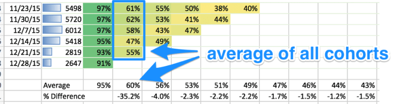
It should look like the below. The cohorts are in the first column, the size is next, and then the number from the original cohort that retained in each subsequent period.
Create another table that computes the percentage values of the original cohort size
Add a conditional formatting element to show the size of the cohorts over time (conditional formatting -> data bars)
Apply conditional formatting to the table that contains the percentages. It should now look like this:
Adding summary rows
Then I create two new rows at the bottom of the percentage table. The first is the average of each column, and the second is the percentage decrease for each additional week.
Wrap it up
Now you have a nicely formatted retention table that shows you:
The size in cohorts over time
At a glance how your cohorts retain over time
Where there are good pockets and bad pockets of retention
The average of cohort retention over time
Which weeks have the biggest drops in retention
Whether your retention levels off over the long term
Where there are many more graphs you could create off of this data set, I think this sets the right foundation for how to quickly look at the data and answer some important questions.
Are there other ways you visualize this information? Do you recommend doing this another way or formatting it differently? Let me know in the comments below.
Disclaimer: all of the data in these screenshots was made up for this example.
In my experience, job applicants rarely ask the right questions when faced with a retention exercise. You can create a retention chart for anything, but I think these are the questions you simply have to ask:
What do the cohorts measure?
What is the criteria for retention (the % of the cohort that returns)?
How can I segment the retention data?
There are many follow up questions you should be asking based on the answer.
Question 1: What do the cohorts measure?
Is it any People? Companies? Revenue? People using it at a company? Is it a subset of any of those concepts?
If it’s people — what kind of people? Is it people who did some action? Example: is it people who signed up for a product? Is it people who saw some value from your product? Bought a product? What is the trend of the cohorts over time? What could affect that? How do you expect the numbers to change over time?
Question 2: What is the criteria for retention?
How is retention measured? If it’s people, what action do they need to take to be counted as having been retained? Why was that chosen? Why is it important?
If it’s revenue, how is it measured?
If it’s an attribute of a person or a company (maybe number of people active), how is that measured? Why was that chosen? How is it important to the business?
Does it level off? If you have a budget to acquire people in the cohorts, how long must they stick around in order to sustain a profitable business?
How does the data change over time? Are there patterns that you would expect to see, or cliffs where things drop off?
Do you expect to see patterns horizontally (step function changes from one cohort to another), vertically (time barriers where cohorts worsen or improve), or diagonally (holidays, press spikes, re-engagement campaigns)?
Question 3: How can I segment the retention data?
Are there pockets in the data that are better or worse than the overall average?
Is there a feature that results in better retention?
Is there a platform (ex: Android, iOS) that is better than another one?
Is there a cohort acquisition source that performs better?
Is there a geography that performs better in retention?
Is there a cohort attribute that results in higher retention? Age / sex / profession of people? Size of company? Industry of company?
If you’re doing a retention exercise in an interview, you don’t even really need to look at the data, you could just ask questions the whole time.
In my time as a product manager, I was constantly reminding myself to talk to customers more. It might have been to talk about existing features, something under development, or customer pain and processes for product research. It was easy in the beginning, because we knew most of the people using the tool as we worked on the initial version. Even as we got bigger, my feelings usually boiled down to these four words: talk to customers more. I think a critical skill, however, is learning how to talk to the right customers.
As I worked on the HubSpot sales products and we grew it to hundreds of thousands of active users, I quickly realized I couldn’t speak to everyone. I needed to be strategic about who I reached out to, and the type of feedback I was looking for. It’s a dangerous path to go down, because you can end up wasting time by over-analyzing your data and getting into analysis paralysis. Even worse, in my opinion, is taking the existing feedback as representative of your user base, and only solving for the loudest segment of the customers or the customers that are most convenient to interact with.
I want to share the process that Brian Balfour showed me. It’s fairly easy (and inexpensive!) to identify who you should reach out to, and collect their feedback.
Step 1: Identify who you want to speak with
Are you working on activation? If so, you want to target people who sign up but don’t really get started or see value. If you’re working on retention, you need to dig into why someone would start to use it but end up quitting your product. Not sure which one you should be solving for? It depends.
Step 2: Find those people
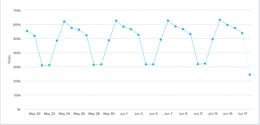
Any good behavioral analytics system will allow you to look at the number of events that someone has done over time. Let’s say we want to find users who start to use the product, but then stop. Most analytics systems will tell you the raw number of times an event happened, or the unique users that did it. Here’s a sample from the Amplitude demo for when someone plays a song:
The graph above is great for evaluating trends, but the goal is to speak with individual users about their experience. You need to go a level deeper and visualize this data on an individual user level. You should be able to get it by the user’s email. Once you have that, export it to Excel so you can play with it more closely.
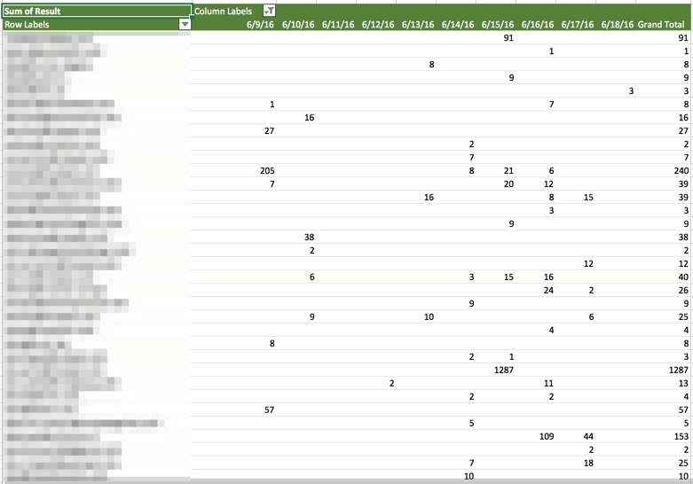
For the next images, imagine I exported data that has the number of events someone performed on a daily basis for my app’s most important events. I then would create a pivot table:
This pivot table has a list of email addresses in the first column, alongside the number of times an event happened per day. You could do the same on an hourly / daily / weekly / monthly basis, depending on what makes sense for your app.
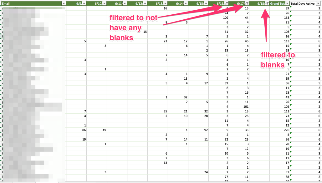
Next, I typically do some more filtering to evaluate who I could speak with. I set up this filter to find the people that weren’t active on 6/18, but were active on 6/16 or 6/17. I expect people to use my app every day, and I am shocked when they don’t. I’m curious to know why they didn’t use it.
You could spend a lot of time doing this type of analysis. I’d try to limit yourself to less than thirty minutes of playing with a spreadsheet like the above. I’d bucket your search into a couple of categories:
Super active users:
They use the crap out of your product, consistently. I’d be curious to speak with them to understand what they like about your product and why it’s so valuable to them.
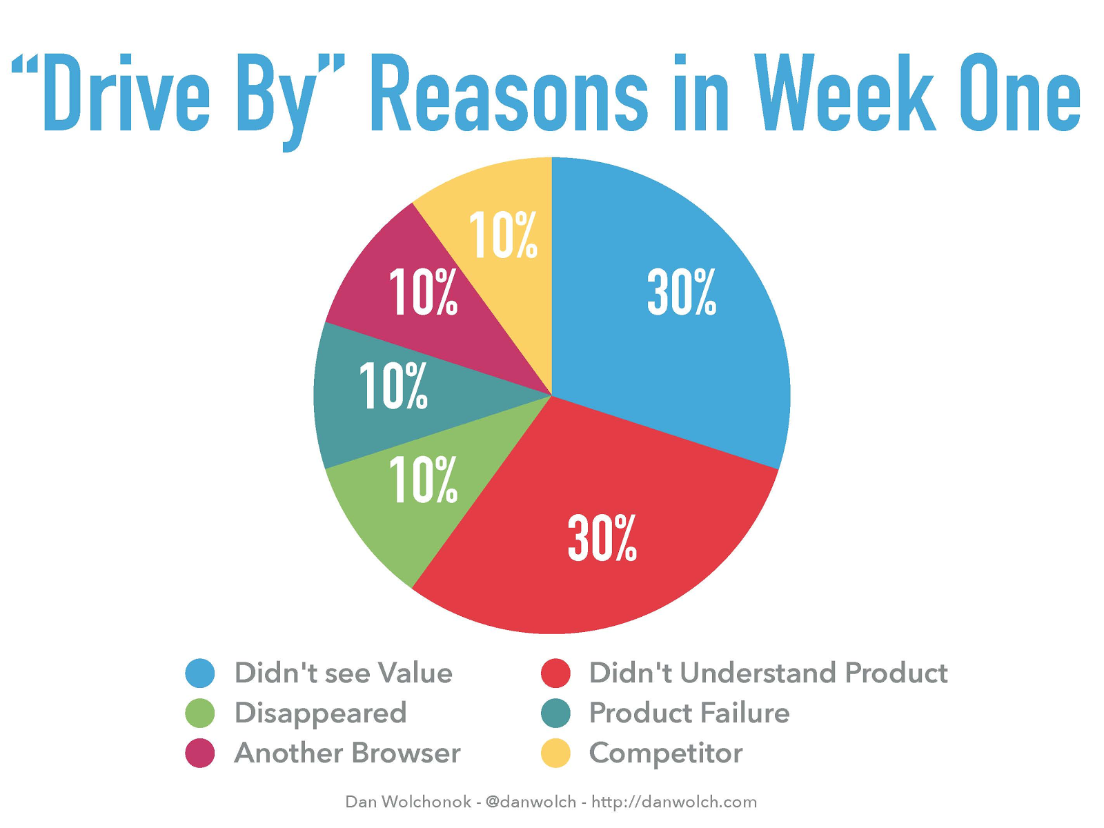
Drive by users:
People who check out your application quickly and then leave, never to return. What was their impression? Why didn’t they stick around? If you’re using a product like Fullstory, are you able to see what they did in your product?
Engaged people who quit
I’d look for people who used it for a minimum of some period (a month? Multiple weeks?) and then stopped using it. These people presumably understand at least a portion of your product, but then took action to stop using it.
As you can see in the screenshot, I added a column where I computed the number of days someone had performed an action. If done over weeks / months, this is helpful to quickly find the users who were long term users.
Step 3: Reach out to users
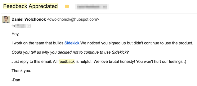
This should produce some users that you want to speak with. Now comes the fun part! I took the list of emails, and I send them an email soliciting feedback. This is where I hear a ton of complaints from product managers like “I don’t have enough people to email” or “people never click through to the survey.”
I typically get 10–20% response rates on the emails that I send out. My secret is that I send out the emails from my Gmail account. I BCC lists of users and when I contacted them so I have a record and don’t email people multiple times. This works for multiple reasons:
It ends up in their inbox, not the promo inbox
It feels more personal, there’s no professional email template
One final key: they only have to respond to give you feedback. Nobody wants to click on a link to fill out a survey.
Here’s the email that I send out:
Nobody wants to click on a link to fill out a survey, even if it’s a one question survey. I often get back soliloquies from users with incredibly valuable feedback. I’m grateful, and I also reply back to the emails multiple times doing a typical five whys analysis. This is another reason why it’s superior to embedding a google form into an email.
Step 4: Collect / Analyze the feedback
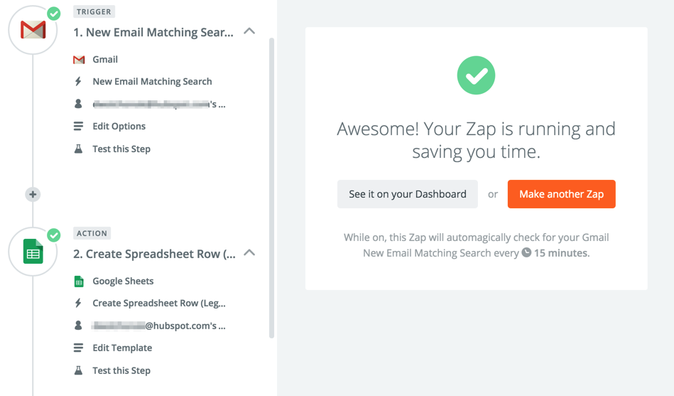
If you choose to send out this survey to a large group of people, it’ll quickly become difficult to report off the trends and high level information. This is where I use Zapier.
I connect the Gmail and Google Docs zaps like this:
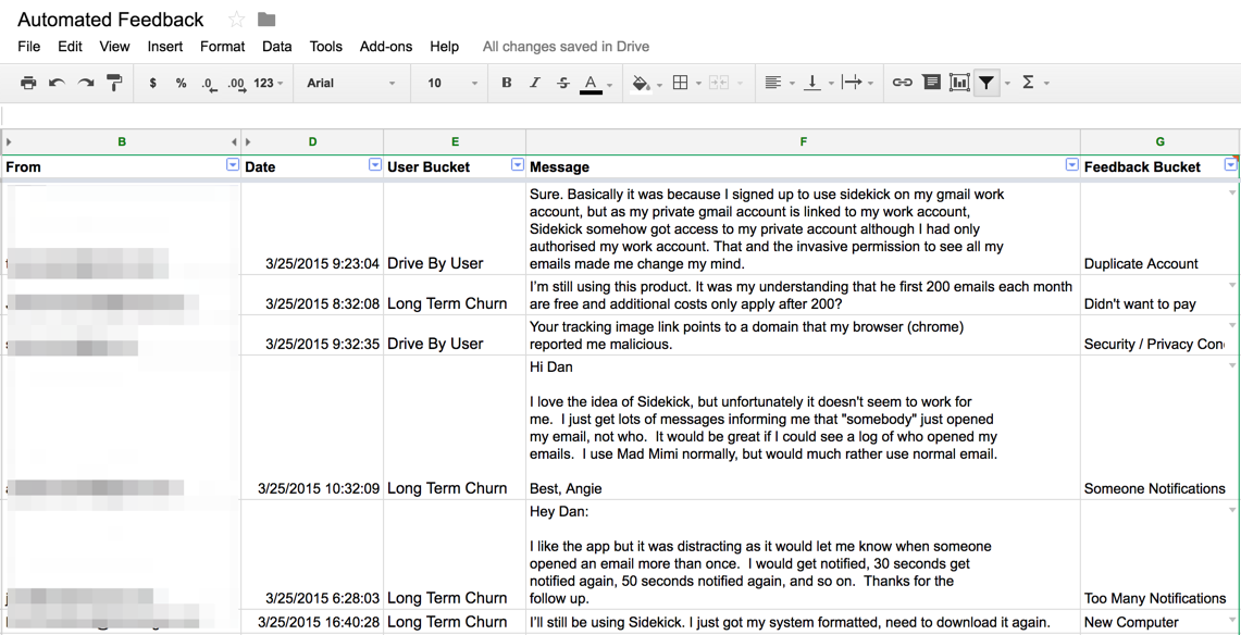
I filter the responses to the survey into a custom label so it doesn’t overload my inbox. I use Zapier to pull the responses into a Google Spreadsheet, so I can easily read them and bucket the responses:
You can see that I have manually gone through and added a feedback bucket for each of the responses. I try to bucket reasons in a handful of categories, and look for common language patterns for how people describe problems. That allows me to create reports for development teams that look like the following:
The value isn’t in doing this with free or low friction tools — the value is in the insight you get into your users and what they love or hated about your product. I’m sure that there are fancy tools that help with this type of analysis, but the bottom line is that you don’t have an excuse for not doing this type of process. It works incredibly fast, produces results, and is free (other than your existing analytics system). I like this because it gets you really close to your users and their behavior, and allows you to quickly get your hands dirty and get some actionable feedback.
How could this process be better? How do you find and the solicit feedback from the users that will have the biggest impact on your company? Let me know through a comment, or drop me an email (it’s on my personal blog).
I took a class in my last semester of business school in 2013 that was about analyzing networks. For our final project, I worked on a team that analyzedDharmesh Shah’s twitter followers. The goal was to identify who might be a good candidate to make an introduction. Below is the complete writeup as we submitted it to our professor, Marissa King.
Problem
Dharmesh Shah is an influential entrepreneur and angel investor. He is the co-founder and CTO of HubSpot, a technology company headquartered in Boston. Dharmesh invests in many early-stage startup companies each year, and entrepreneurs routinely court him as a mentor and investor. As an incredibly busy executive and investor, Dharmesh is not an easy man with whom to get an audience.
Our group set out to analyze Dharmesh’s network to find the most influential people. By identifying the most connected people in his circles and the networks in which they operate, someone could prioritize their efforts in getting introductions.
Hypothesis
A strategy to influence Dharmesh starts with influencing those who can influence him. Therefore, we built our analysis on two hypotheses:
Dharmesh’s network looks similar to our own, in that it has important sub-networks.
Within these communities, there are people who can influence Dharmesh.
If network analysis can identify these influential individuals, one could effectively surround Dharmesh, gaining connections to him from a variety of his networks.
Methodology
Our analysis uses information gathered from Twitter rather than LinkedIn or Facebook. Twitter is unique and different from these two social networks because it is public by default. Twitter has an asymmetric follower pattern where anyone can subscribe to the updates of another person; both parties do not have to choose to connect. Since many in the technology community use Twitter as a news and information service, it would be a good indication of whom someone respects and looks to for interesting and influential information.
To analyze who is influential to Dharmesh, the analysis focused on people Dharmesh currently follows. Through the twitter API, we downloaded:
The twitter accounts that Dharmesh follows
The twitter accounts that follow those accounts
We downloaded over 10 million pieces of follower information as pairs of directed edges (the people that influence Dharmesh, and the people that follow those influencers). We put the data into a relational database so that we could model the edges and query it on an ad-hoc basis.
In order to determine the influencers within the network of people that Dharmesh follows, we created a graph of the mutual connections. We only graphed a connection between two people if they both followed each other. This removed many edges in our graph because many relationships only had a single directed edge. We felt that this was a better indication of a relationship and would highlight communities of influence more effectively.
Analysis
Looking at Twitter data instead of Facebook or LinkedIn has the advantage of portraying what Dharmesh is currently working on and thinking about, as opposed to his entire personal or professional network. This has the benefit of identifying what will pique his interest, since we assumed that he only follows people that share content that is interesting to Dharmesh.
In analyzing the network graph, there are clusters that represent the Boston startup community, Silicon Valley, and HubSpot employees and alumni. Contrary to the graphs of our personal network analysis, the groups were highly integrated with one another and were hard to distinguish. We believe this to be the case because anyone can follow anyone else on Twitter; there is no expectation of being friends or having worked together professionally. If someone is sharing interesting content on Twitter, individuals are accustomed to following others they may not have met in real life. We believe that explains the lack of separation of subgroups that are present in the Facebook and LinkedIn network graphs.
Our group expected to see more subgroups that are distinct in Dharmesh’s network of influencers. In our professional and personal graphs, we each had communities that represented high school, college, professional groups, and graduate school networks. We were only able to identify three separate sub groups in Dharmesh’s graph, with only one company and two regional communities. While surprising at first, we believe it is driven by the interaction that takes place on Twitter. Rather than accumulating contacts, Twitter is about what is interesting to you at the current time and many users regularly unfollow others based on their tweets. This is very different from Facebook or LinkedIn, where you rarely remove a friend.
It is not surprising that Silicon Valley represented a significant element of Dharmesh’s graph of influencers, since the region is the largest in terms of venture capital and startups. Boston did not represent more of the influencers graph, but again that may have been influenced by the fact that Silicon Valley is responsible for a majority of the innovation in the technology and startup industry. There were two subgroups that represented members of the Boston startup community, which is interesting considering that HubSpot has been one of the fastest growing startups in Boston for many years. For any entrepreneur looking to gain access to Dharmesh, it represents two opportunities for identifying individuals. Additionally, it may indicate that there are few influencers in the HubSpot community that have a strong following in Boston or Silicon Valley. That makes sense given that Dharmesh is one of the most highlighted entrepreneurs in Boston and one of the biggest public faces of his company.
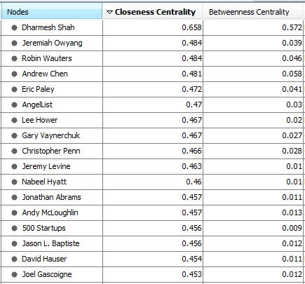
In order to identify the people in each subgroup that would be helpful in influencing Dharmesh and the people he follows, we analyzed thebetweenness and closeness centrality for each person in the graph. In this analysis, we sought to identify people who could influence Dharmesh, but would be accessible because they are not as popular and sought after as a mentor and investor. As an entrepreneur would, we inspected the highly ranked individuals to determine who would result in the best outcome. If the person were as popular as Dharmesh, it would not make sense to reach out to him or her.
Recommendations
To get in front of Dharmesh, it is important to look not only at the closeness centrality of the target contact, but also his or her role in the industry and how likely he or she would be able to connect you to Dharmesh. The person with the highest closeness centrality is actually an industry analyst for Altimeter Group, which is a research and advisory firm. Without additional knowledge, a target such as Jeremy Owyang would likely offer industry insight, but not potential contacts, since many would likely look to him for market research.
Instead, we would recommend trolling through the list ranked by closeness centrality and cross-referencing it with information that can be gathered elsewhere. With this approach, Jeremy Levine, David Hauser, Dan Abdinoor and Eric Paley seem to be the best targets. Jeremy Levine and David Hauser are both young entrepreneurs that Dharmesh follows that are deeply connected to the Boston startup community. While they have already established a reputation in the Boston VC community, they are likely more open to and available for meetings. Dan Abdinoor has worked at several startups in Boston, and is at the center of the HubSpot subgroup even though he is no longer employed by HubSpot. This is most likely due to the fact that he was one of the first ten employees hired and stayed through tremendous growth.


Recent Comments